

Forex Reversal Candlestick Patterns for Smart Trading
📉 Discover key forex reversal candlestick patterns to spot market shifts. Boost your trading skills with practical tips tailored for South African forex traders.
Edited By
Natalie Rivers
Candlestick charts have long been a reliable tool for traders exploring financial markets. At their heart, these charts provide a visual summary of price action during a specific period—be it minutes, hours, days, or weeks. Unlike simple line graphs, candlesticks capture more detail, showing the open, close, high and low prices all at once.
In South African markets—whether stocks listed on the JSE, Rand-Dollar currency pairs, or commodities like gold—understanding candlestick patterns can help you spot potential turning points or confirm ongoing trends. This skill is especially handy when charts appear cluttered or if you prefer blending technical analysis with fundamental views.
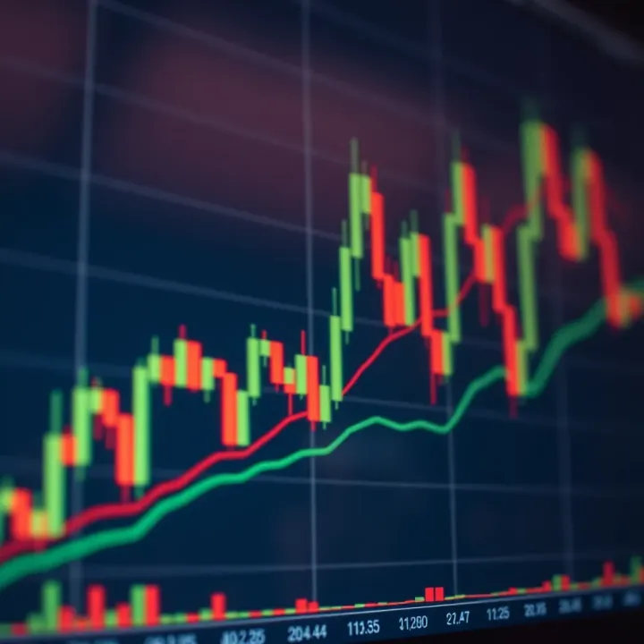
A typical candlestick has three parts:
Body: The thick part between the open and close prices. It’s filled or coloured differently depending on whether the price closed higher or lower.
Wicks (or shadows): Thin lines above and below the body, showing the highest and lowest traded prices during that time.
Colour: Usually, a green or white body indicates an up period (price went up), while red or black signals a down period.
Recognising common patterns formed by one to several candlesticks offers clues about market sentiment. For instance, a ‘hammer’ suggests a possible price bottom, while a ‘shooting star’ can warn of a topside reversal. Traders often rely on these signals to make entry or exit decisions, especially when combined with other tools.
Candlestick patterns are like market fingerprints—they reflect collective emotions of buyers and sellers and help decode the often noisy behaviour of price movements.
Here’s what you can expect:
Clear definitions of major candlestick patterns
Examples of how these look on real charts from South African stocks or forex pairs
Tips on using patterns with common indicators for better signals
By building your candlestick reading skills, you gain a sharper edge to anticipate market moves without relying solely on indicators or news. This knowledge complements your trading strategies and helps you confidently interpret what the market is ‘telling’ you.
Candlestick charts are a staple in trading, offering a clear snapshot of price movements within a specific timeframe. For anyone serious about analysing market behaviour — whether in shares, forex, or commodities — understanding these charts is foundational. They condense complex price data into visual segments that traders can interpret quickly, aiding smart decision-making in fast markets.
Candlestick charts display price activity for a defined period using vertical bars, each resembling a candle. Each 'candlestick' reflects four key prices: opening, closing, high, and low. Unlike simple line charts, candlestick charts reveal the battle between bulls (buyers) and bears (sellers) in a way that's easy on the eye. South African investors, for example trading on the JSE, benefit from candlestick charts because they clarify trends and reversals that might otherwise be missed on basic graphs.
The body forms the main part of the candlestick and shows the range between the opening and closing prices within the set period. If the closing price is higher than the opening, the body often appears unfilled or green-ish (depending on the chart settings) signalling buying strength. If it closes lower, the body is filled or red, indicating selling pressure. This visual helps traders spot bullish or bearish sentiment at a glance.
For instance, during a day when a stock opens at R100 and closes at R110, the body reflects a gain of R10. This is a quick reference to whether buyers dominated.
Wicks, also called shadows, stretch above and below the body to show the highest and lowest prices reached during the timeframe. Long upper wicks might hint that sellers pushed the price down after an attempt to rise — a sign of potential resistance. Conversely, long lower wicks may suggest buying interest after prices dipped, signalling support levels.
Imagine a share that opens at R50, trades as high as R60, but closes at R52 with a long upper wick. Traders reading this might suspect some resistance around R60.
These prices determine the body of the candlestick and are crucial for interpreting market mood. The difference between opening and closing points tells whether buyers finished stronger than sellers or vice versa. A close near the high indicates bullish strength, while a close near the low points to bearish dominance.
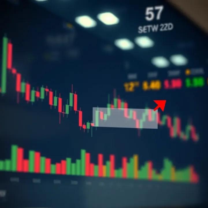
For example, if a share opens at R20 and closes at R18, buyers struggled, possibly indicating a downtrend developing for the day.
The highest and lowest prices capture market extremes during the period. The highs can represent resistance areas where sellers gathered, while lows might mark support where buyers stepped in. Recognising these can help spot price barriers or breakout potential, essential for setting stop-loss orders or targets.
A stock that dips sharply to a low before rebounding could be setting a foundation for an upwards move. Paying attention to these extremes refines trade timing and risk management.
In candlestick analysis, bullish candlesticks reflect upward price movement — buyers are in charge. Bearish ones show the opposite, sellers driving prices down. By watching sequences of these candlesticks, traders can get a sense of market momentum.
For example, a long bullish candlestick after a series of small or bearish ones might signal a trend reversal. South African traders often pair this insight with volume data from platforms like EasyEquities or Standard Bank's trading app to confirm the strength of the move.
Remember: Candlestick charts are tools, not crystal balls. Using them alongside other indicators can improve accuracy.
Grasping the components and signals from candlestick charts builds a solid base for reading markets. This understanding is key before moving on to recognise specific patterns and make informed trading choices.
Single-candlestick patterns offer traders quick insights into market sentiment without waiting for multiple data points. These patterns matter because they can signal potential shifts or pauses in price movement, helping investors decide whether to hold, buy, or sell shares ahead of bigger moves. To grasp candlestick basics means to improve timing, reduce guesswork, and manage risk effectively. The simplicity of single-candle analysis makes it a favourite starting point for many traders, especially when combining it with other technical tools.
A Doji forms when a stock’s opening and closing prices are almost equal, creating a candle with a very thin body and long wicks. This pattern points to indecision in the market — buyers and sellers are essentially at a stalemate. For example, if a share trades between R100 and R105 but closes near R102 after opening at R102.50, a Doji is created. In a rising market, a Doji might hint that buyers are losing steam, and a reversal could be around the corner. Conversely, during a downtrend, it could mean sellers are weakening. Importantly, the Doji alone doesn’t guarantee a change; it’s a warning sign traders should watch for confirmation from the next candles.
Both the Hammer and Hanging Man candles have small bodies with long lower wicks, but their impact depends on the current trend and their position. A Hammer appears after a downtrend. Its long lower wick shows that price was pushed down but recovered strongly, suggesting buyers may be stepping in. For instance, a share that dipped to R50 but closed near R55 after opening at R54 forms a Hammer. This could mark a bullish reversal if confirmed by higher closes later.
The Hanging Man looks like a Hammer but arises in an uptrend, signalling potential bearish reversal. The long wick shows selling pressure creeping in, even if the candle closes near its opening price. Traders should be cautious here and look for signs of weakness soon after.
Spinning Tops feature small bodies with wicks extending on both ends, reflecting uncertainty and a tug-of-war between buyers and sellers. This pattern suggests that neither side has clear control, often signalling a pause in the current trend. For example, if a share moves only slightly up or down within the day but swings above and below its opening price, a Spinning Top appears. These candles commonly show up before trend changes or sideways movement. Paying attention to volume alongside the Spinning Top can offer clues — low volume hints the pause might continue, while higher volume could mean a breakout is likely.
Single-candlestick patterns provide handy clues but rarely dictate action alone. Watch for context, trend direction, and confirmation to make sound trading calls.
These basic patterns are a solid foundation for interpreting charts and timing trades, particularly in volatile markets like those experienced locally. Understanding these will make setting entry and exit points far more confident and grounded in actual price behaviour rather than guesswork.
Multiple-candlestick patterns offer a clearer picture of market sentiment than single candlesticks alone. By analysing two or more candles, traders can spot stronger signals about potential trend reversals or continuations. This helps you make more informed trading decisions and avoid false signals that single-chart patterns sometimes produce.
The engulfing pattern is a straightforward but powerful indicator of a shift in momentum. It involves two candles where the second completely 'engulfs' the body of the first. In a bullish engulfing scenario, a small bearish candle is followed by a larger bullish candle, suggesting buyers have taken control. For example, if shares in a JSE-listed company like Woolworths weaken one day but the next day’s bullish candle crashes through and closes above the previous day’s open, it could signal a strong buying opportunity.
Conversely, the bearish engulfing pattern shows a small bullish candle followed by a larger bearish candle, often hinting at the start of a downward trend. Traders in volatile sectors like mining stocks should keep an eye on this pattern as it may warn of falling prices ahead.
These patterns are three-candlestick formations commonly found at market turning points. The Morning Star signals a bullish reversal after a downtrend. It starts with a strong bearish candle, followed by a small indecisive candle (like a Doji or Spinning Top) often with a gap down, then capped by a bullish candle that closes well into the body of the first candle.
Imagine Sasol shares dropping sharply one day; the next day, the market hesitates, and then on day three, a strong rise pushes prices higher. This pattern builds confidence that the selling pressure is easing.
The Evening Star is the opposite, signalling a bearish reversal at the top of an uptrend. It often points to profit-taking or emerging negative sentiment. Recognising these stars early can be particularly useful during busy periods like the end of a financial quarter when market swings can be unpredictable.
These patterns indicate sustained moves and help confirm the strength of the ongoing trend. Three White Soldiers consist of three consecutive long bullish candles, each closing progressively higher, signalling robust buying interest. Traders might spot this in a strong-performing stock like Naspers during positive earnings reports.
On the flip side, Three Black Crows comprise three bearish candles closing lower in succession, signalling firm selling pressure and a likely continuation downwards.
Spotting these patterns can help you align with the market's momentum, making your entry and exit points more precise.
By learning to identify these multiple-candlestick patterns, you add an essential tool to your trading kit that better reflects market psychology beyond individual price bars. Practising their recognition on familiar JSE shares or global stocks will build your confidence applying chart analysis in real trades.
Candlestick patterns serve as visual signals that help traders make sense of market movements, providing clues about potential price direction. Using these patterns in your trading toolkit can greatly improve the timing of your entry and exit points. But seriously, relying on candlestick patterns alone isn’t enough — confirming them with other data helps avoid jumping the gun on false signals.
Volume is a key confirmation tool when working with candlestick patterns. For example, a bullish engulfing candle on low volume may lack strength, whereas on a surge in trading volume, it’s a sign buyers are stepping up actively. Combine volume with momentum indicators like the Relative Strength Index (RSI) or Moving Average Convergence Divergence (MACD) for a clearer picture. If a hammer pattern shows up near oversold RSI levels and volume spikes, that’s often a more trustworthy signal.
Besides volume and oscillators, trend indicators such as moving averages provide context. Spotting a morning star formation when the price hovers above its 50-day moving average carries more weight than the same pattern deep in a downtrend.
Successful use of candlestick patterns requires defining precise entry and exit points. Consider entering a trade when a pattern completes at a support or resistance level confirmed by volume. For example, after spotting a three white soldiers pattern, entering just after the close of the third candle, with stop-loss set below the low of the first soldier, helps manage risk.
Exit strategies could involve scaling out profits near prior resistance or setting a trailing stop to lock in gains while allowing room for the trend to develop. If a bearish pattern, like an evening star, appears, taking profits or tightening stops on longs may be in order.
A major trap is reading patterns in isolation or during choppy, sideways markets where signals often misfire. For instance, doji candles may cause confusion unless you check broader trend context or volume spikes. Sometimes, patterns form but don’t follow through; this is why confirmation from other tools matters.
Also, avoid overtrading by chasing every pattern. Filtering signals by waiting for confirmation — say, a close beyond a moving average after a pattern — reduces whipsaw trades. Finally, market conditions such as loadshedding can impact trading volume and execution, so always factor in local realities.
Using candlestick patterns is like getting a weather forecast for the market — it can show you when skies might clear or storms approach, but you still need your umbrella and waterproof boots just in case.
By combining candlestick patterns with volume, indicators, and sound risk management, you significantly boost your chances of making solid, informed trading decisions. Give patterns their due respect but treat them as part of a bigger analytical toolkit rather than crystal balls.
📉 Discover key forex reversal candlestick patterns to spot market shifts. Boost your trading skills with practical tips tailored for South African forex traders.
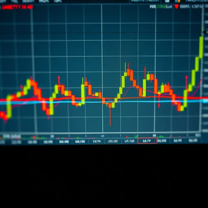
📊 Master candlestick chart patterns for smarter trading! Discover key signals, practical tips, and handy PDF resources tailored for South African investors.

📈 Learn how to spot key chart patterns to predict market shifts and improve your trading strategy. Perfect for South African traders aiming for smarter investments.
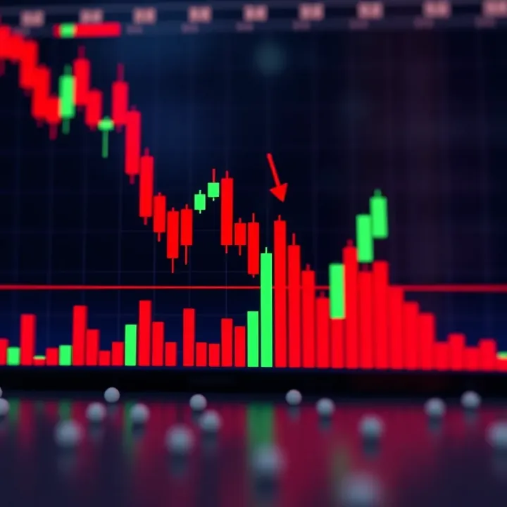
📈 Learn to read candle chart patterns clearly with practical tips for South African traders. Spot bullish and bearish signals, combine with volume and timeframes for smarter trades.
Based on 13 reviews